architecture

3 posts

Fifty Years of Ugliness

The Australian Ugliness (Robin Boyd, Text, 1960/2010)
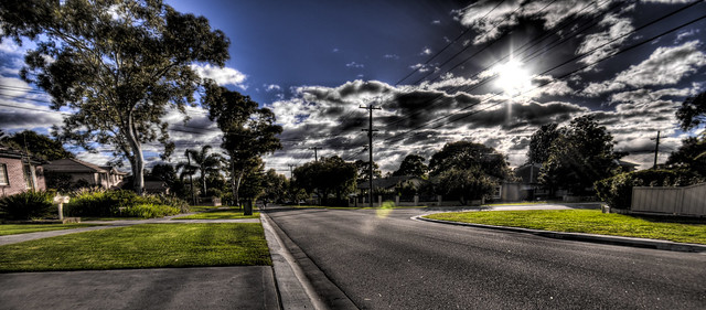
Como Street

In 1960 Robin Boyd’s The Australian Ugliness became the classic treatise on the malaise of this country’s architecture and planning, offering a withering critique of all that Boyd found wanting in the Australian built form of the late 1950s. The book has now been re-issued in a handsome fiftieth-anniversary edition, with Boyd’s text bracketed between an introduction by Christos Tsiolkas and an afterword by John Denton, Phillip Goad and Geoffrey London, and its reappearance provides an interesting prompt for reflection. In the subsequent half century our cities have expanded astronomically, and no doubt there is plenty of ugliness out there in the built environment. But what kind of ugliness? Have we moved on from those trends that so bothered Boyd? And if so, have we just found newer, more effective ways to blight our landscape?
Continue reading

Deserted Disney World

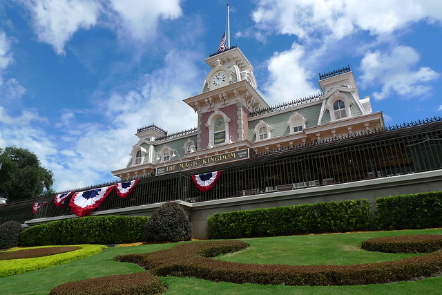
As a companion to my photos of deserted Disneyland, here’s a selection of shots of the Magic Kingdom at Disney World. Once again, for a sense of why this might be interesting, I suggest you look at my post about Disneyland as an example of urban design.

As I suggest in that article, I don’t think the design of the Magic Kingdom is nearly as successful as the original Disneyland, although this is hard to fully convey in a series of photos. The architecture is grander and more show-offy, and hence more vulgar and less charming.

P1060071
Continue reading

New Home Showcases Innovative Alternatives to Good Design

An inner-city dwelling is being held-up as a model for other architects and builders to emulate after it incorporated a number of innovative alternatives to site-responsive design.

The project was inspired by recent designs that super-imposed images of Victorian buildings onto contemporary buildings in heritage streetscapes. “We took that basic design principle to its logical conclusion,” says designer Tony Le Corboxier. “We built a three storey concrete tilt-panel box and etched an image of a well-designed and sensitively sited building onto it.” In a satirical nod to the stuffy, old-fashioned ways of the past, the building chosen as the subject of the etching was the home demolished to make way for the new building.

The new dwelling, called simply “Innovative Brilliance,” was commended upon its completion by architectural commentators, who remarked upon its avoidance of clichéd design elements such as ornamentation, verandahs, parapets, eaves, doors, windows, or architectural merit. “This building has none of those things,” said Le Corboxier. “Architects often talk of thinking outside the box. But that’s defeatist. They just haven’t made the box big enough.”

Continue reading